Friday, November 7, 2014

The Value in Value

by Jennifer L. Hoffman

 Behind the Clouds,   charcoal on paper, private collection, © Jennifer L. Hoffman.
It is very easy to see value in a drawing, as the entire image is created 
with only black, white, and shades of gray. Behind the Clouds
charcoal on paper, private collection, © Jennifer L. Hoffman.

In art, value is simply how dark or light something is.  There are many, many elements that must come together in a painting in order for it to be successful. It can be argued that, at least in representational painting, none is more important than accurate value. 

There are some great quotes out there about value in painting.*  Here's one, oft-repeated by artists, attribution unknown:
"Value does all the work; color gets all the glory." 

Or this one, from the author of Design and Expression in the Visual Arts, John F. A. Taylor: 
"There are painters... who know how to dispense with hues and saturations.  There is no painting which can dispense with values." 

Or this gem from Harley Brown:
"In painting, as in life, you can get away with a lot as long as you have your values right."


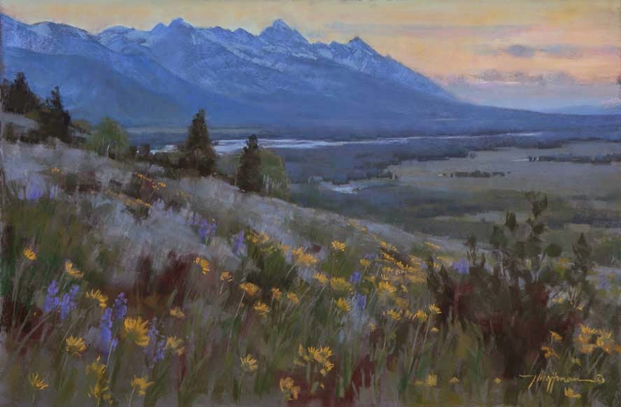
Evening Song, pastel on board, 20x30, available. © Jennifer L. Hoffman.
There are many similar values in this pastel.
You might think of value as the skeletal structure on which the rest of the painting hangs.  If an artist carefully observes and transcribes the values of a scene, the color he or she uses can be realistic or completely imaginary, but the scene will still make sense to the viewer.  (Click here for some examples of realistic value/imaginative color from a past show on Hungarian Fauvism).  If the values are off, however, no amount of color manipulation will make the painting work.  

Evening Song, pastel on board, 20x30, available. © Jennifer L. Hoffman.
Our brains have a surprising amount of preconceived ideas about what colors and values are or should be. Master artist and teacher Ned Jacob learned a lesson about the difference between our preconceptions and reality when painting with his mentor, Robert Lougheed. "The first time the two worked outside together, Jacob painted a horse with rich, dark color and black shadows.  When Jacob finished the picture, Lougheed walked over and studied it for awhile.  'Now what would you use if you were painting a post hole in that shadow?'" (Sandra Dallas, Sacred Paint: Ned Jacob, Santa Fe, NM: Fenn Galleries Publishing, Inc., 1979.)  The notions that we grow up with (snow is white, shadows are black, etc) often go unquestioned until we learn to truly observe the world around us.

A number of common problems in paintings can be directly attributed to value errors.  Ned provided me with an "Aha!" moment just as Lougheed had done for him decades before, when he made this observation while watching me struggle with a plein air study: "If you can't seem to get your values light enough, you probably aren't painting your darks dark enough."  Whoa.  That one cracked my head wide open!  It made so much sense, but I had never realized it.  Another example of a value problem is something often bemoaned by beginning artists - muddy color.  A muddy color is just a grayed color of the wrong value (and/or temperature - see Kathryn's post on color for more on the concept of temperature). 
  
So how does an artist determine correct values in a subject?  Values are in fact a set of relationships.  Determining the darkest dark in a composition and the lightest light is a great starting point.  And one of the best ways to see general values is to do something you've heard mentioned on this blog before.  SQUINT.  Squinting at a subject eliminates unnecessary detail and simplifies the main information.  In general, the darkest darks will be found in the center of interest of your composition, or in the foreground of a landscape (this is a rule of thumb - many artists have purposefully and successfully broken that rule).  Once the darkest dark and lightest light have been determined, the values of other elements in the subject can be determined through comparison.  Using thumbnail sketches helps to map out the most important value areas and to determine the value relationships throughout the composition. 


Four Eggs, pastel on mounted paper, 9x12, available.  © Jennifer L. Hoffman.
The darkest darks are in the cast shadows beneath the eggs in this painting.
 
Four Eggs, pastel on mounted paper, 9x12, available.  © Jennifer L. Hoffman.
Four Eggs, pastel on mounted paper, 9x12, available.  © Jennifer L. Hoffman.
Artists often manipulate the value range in their paintings for emotional or artistic effect.  Paintings that stay in the lightest value range are referred to as "high key" paintings, where the darkest dark might be a middle gray. 
Whisper, pastel on board, 11x14, available. © Jennifer L. Hoffman.
A close value range in this pastel creates an introspective, quiet mood.

Whisper, pastel on board, 11x14, available. © Jennifer L. Hoffman.

Whisper, pastel on board, 11x14, available. © Jennifer L. Hoffman.

Likewise, paintings painted in the lower scale of the value range are called "low key" paintings, where the lightest light might be a middle gray.  Paintings with subtle value shifts and close value ranges communicate a different feeling than those with big contrasts.  All of these choices reflect the artistic voice of the image maker.


A Worn Path, pastel on mounted paper, 20x16, available.  © Jennifer L. Hoffman.
Value contrasts create a sense of sun and shade.
A Worn Path, pastel on mounted paper, 20x16, available.  © Jennifer L. Hoffman.
A Worn Path, pastel on mounted paper, 20x16, available.
© Jennifer L. Hoffman.

I leave you with a quote from the great master, John Singer Sargent:

"Color is an inborn gift, but appreciation of value is merely training of the eye, which everyone ought to be able to acquire."

When you are out and about in the world, take a moment to squint.  See if you can find the darkest dark and lightest light in the view you see.  Do the same when you look at art.  The more you practice, the easier it becomes.  Sargent would be proud of you.
_____________________________________

*A great source for quotes on all manner of art topics can be found on Robert Genn's fantastic website: www.art-quotes.com

Monday, September 29, 2014

What it takes to Paint in COLOR

by Kathryn Mapes Turner
 
"Color in a picture is like enthusiasm in life"-Vincent Van Gogh

 
Volumes can be written on the subject of color. Since it is autumn, we couldn't resist touching on this subject for this month's article.   No doubt about it, the experience of color is a special part of life and no one does color like Mother Nature. In the summer, she exhibits the bright colors of the wildflowers.  Currently, Jackson Hole is ablaze with golden aspen leaves, red mountain maple, and all is off-set by distant blue mountains and evergreens.  Soon, the landscape will be blanketed in white snow with shimmering blues and greys. 
     
As painters, we are challenged and inspired by the effects of light on all these colors found in nature.  Everything has what can be referred to as a color note.  A color note is the combination of hue, value (light and dark) and intensity. 

  
REMEMBERING ROY G. BIV

Depending on how it is being effected by light at that moment, we can identify the color note of our subject. The first thing we can ask is where the color note lies in the spectrum of the rainbow of colors.  This is referred to as the hue.  Remember the acronym we learned in grade school, Roy G. Biv?  Red, orange, yellow...These are the color names, or hues. In this painting of the Gros Ventre range, the hue of the sky is blue and the grass is yellow-green.


Cloud Veil by Kathryn M. Turner 16 x 20 oil on linen. Available

If there is smoke in the air, it is sunrise or sunset, the sky would likely have a different hue.  Similarly, grass is not always green.  Later in the season, this same field is a honey wheat hue. Within each hue, there is a spectrum of value, intensity and temperature.

 
VALUE

When creating a painting, we must also consider the relative lightness or darkness orvalue of an area.  There is a saying in our industry- "Color gets all the credit, value does all the work." It is the relationships of values within a painting that depicts a sense of space and form. In this painting, there is not a broad range of hues represented, but the contrast between the light and dark values describe to the viewer  the shapes of the rocks and how the water streams through them.  


INTENSITY

 Each color note in a painting can be bright or dull. This refers to the intensity or relative strength of saturation of any given color.  As a general rule, colors in the distance appear lighter in value and less intense than when viewed close up.  In nature, colors are often less intense than the colors that come out of our paint tubes.  To obtain these subtle colors, we mix colors with their compliments in order to make their chroma  less intense.

The Refinement of Nature by Kathryn M. Turner 9 x 12 oil on linen
 TEMPERATURE

 Each hue also has a relative temperature.  Cool colors have a bias toward blue, green and violet. Warm colors have a bias toward red, orange or yellow.  This is how it is possible to have a "cool" red such as alizarin crimson or a 'warm blue' such as french ultramarine.

 
Everything around us is an array of color. The vivid light and color of the world is what compels us to paint. As we strive to continue to understand the world of color, we do our best to create artwork that moves in a similar way. 


Jackson Peak in October by Kathryn M. Turner 9 x 12 oil on linen


Sunday, August 31, 2014

When is Fine Painting Like Cooking?

Q: When is Fine Painting like Fine Cooking?

A: When the artist knows what to put in and what to leave out.

  Bill Sawczuk


http://www.triofineart.com/424403/bill-rsquo-s-current-work/
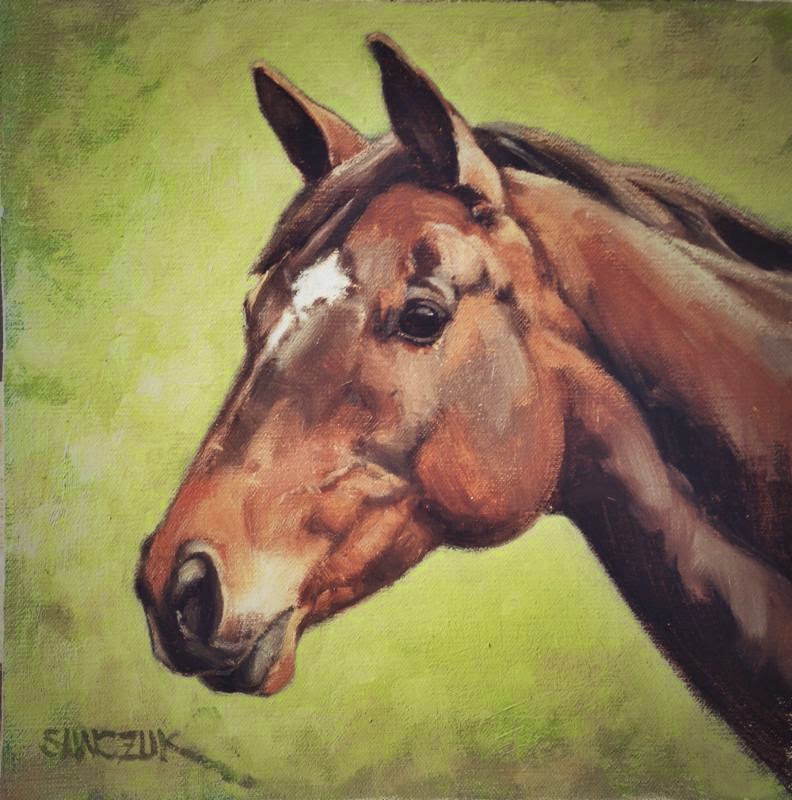
Running Horses, oil on linen, 12x16. © Bill Sawczuk, 2014.

When I was a kid in the 50s, we used to eat a lot of soup.  Sometimes the soup contained everything in the icebox (that's right, the icebox), and although it was flavorful, we couldn't tell what flavor it was.  It was called garden soup, but sometimes we called it garbage soup.  I think that the same thing could be applied to painting.  If you put too much in, the picture might be painted well, but the viewer might not recognize the subject .   
http://www.triofineart.com/424403/bill-rsquo-s-current-work/
Peaceful Afternoon, oil on linen, 8x10. © Bill Sawczuk, 2014.

http://www.triofineart.com/424403/bill-rsquo-s-current-work/
Stippy's and Moran, oil on linen, 9x12. © Bill Sawczuk, 2014.
We are often tempted while painting en plein air to include everything that we see in the scene.  We may feel that the viewer might need all the facts to understand the picture.  The crucial time to resist the temptation to put everything in the soup is in the early composition stage of the painting.  Ask the question,  "What do I need to tell the story?"  The all-inclusive data is in the scene before me, but what should I leave out?  What can the viewer complete in his own analysis of the painting?  Will I clutter up my efforts to express my reaction to the scene by including every tree, every branch, every rock, etc.?  All of these elements may be hinted at in my painting, and the viewer will know that it is a forested, rocky scene.
 
Zero in on the subject.  Know what you are trying to say.  If you don't know that, why are you painting?  If you are trying to show the beauty of horses running through a pasture , for example, what more do you need than the horses and the pasture?  Do you need fences, barns, rocks or anything else? Paint the horses  as well as you can. Try to show their grace and their spirit .  If you can do  that, you will be successful.  Your painting will be complete, and you won't have to throw anything else in!
http://www.triofineart.com/424403/bill-rsquo-s-current-work/
Texas Blood, oil on linen, 10x10. © Bill Sawczuk, 2014.
 
 
We want to share our artistic process with you! 
This is a continuing series of posts here on our gallery blog:
Behind the Brushes  -  http://triofineart.blogspot.com
The artists at Trio will be taking turns writing about art and sharing on the last week of each month.  If you have a question or an idea for a post, please email us at trio@triofineart.com
or call 307-734-4444.
 
Visit our website at www.triofineart.com
 

Monday, June 30, 2014

Painting on the Edge


photo © Tammy Christel
By Jennifer L. Hoffman


No, I’m not talking about dangling from the edge of a cliff or balancing an easel on a razor thin ridge line   (though I’ve known a few artists who’ve been close).  When I was first starting out as a plein air painter, an artist I admired gave me some advice.  “Pay attention to the edges when you are painting.  Don’t leave your edges unresolved.”   Lacking self-confidence, I didn’t question the statement, but I wondered what he meant.   The edges of my canvas??

In the years since, I’ve learned the value of that advice.  What he actually meant was, “Pay attention to how shapes come together in your painting.”  Determining how two areas meet and successfully painting that meeting place (or edge) conveys the light conditions and gives the illusion of depth (or lack of it) in a painting.  One technique artists use to see edges is to squint at the subject.  When squinting, some edges will remain relatively sharp, while others become soft or disappear altogether.
There are essentially three types of edges to consider in a painting:

1.       Hard edges, where the edge is crisply defined, for example a roofline in bright sunlight or a strong cast shadow.  The shapes with the hardest edges draw the viewer’s eye and give an object a sense of sharp focus.
The hardest edges are in the foreground tree and its 
branches, making it feel closest to the viewer.
Earthshine, Jennifer L. Hoffman, pastel on mounted paper, 27x19.5 in.

2.       Soft edges, where the edges of shapes are less distinct but still discernible.  This could be the edges of foliage at the top of a tree or a distant hillside meeting the sky.  These shapes tend to recede or sit back from the front picture plane.

Tranquility Study, ©Jennifer L. Hoffman, 2014.
 The soft edges of the reflection appear to sit below the hard edges of the creek banks.
Tranquility Study, Jennifer L. Hoffman, pastel on board, 9x12.

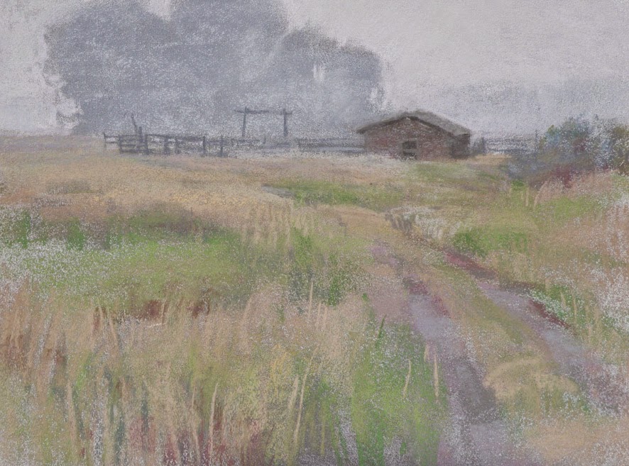
 3.       Lost edges, where one form melts into another.  This happens often in low light conditions and in weather like rain, snow, or fog.  These lost edges do not compete for attention but can be some of the most interesting to paint!
There are nearly no hard edges in this pastel.  Soft and lost edges add to the sense of mystery.
Veiled, Jennifer L. Hoffman. Pastel on board, 12x16.

Of course, the degree of hardness or softness (or lost-ness, if I may coin a new word!) is relative, and the artist orchestrates those edges in a painting to draw a viewer’s eye to a specific focal point or to move the viewer through the composition. Interestingly, everyone seems to interpret edges a bit differently, even when looking at the same thing.  Some artists see many hard edges and paint accordingly.  Some see things in a much softer way.  Being able to translate the way he/she sees edges allows an artist to not only create an illusion of space and light but to share a bit of his/her personal artistic vision.

Next time you come to Trio or visit another gallery or museum, look for hard, soft, and lost edges.  You’ll be catching a glimpse into the artist’s process!

Monday, June 2, 2014

Paintings from Photos vs. Life


We Weigh in on a Historic Debate

Photographic technology has been a helpful tool for artists for hundreds of years.  Leonardo da Vinci and Johannes Vermeer are thought to have 
used a camera obscura.  Artists like Edgar Degas, Alphonse Mucha, Paul Cezanne and Pablo Picasso have all used this tool. A camera captures the fleeting moments of sunrise, the flight of a flock of birds, a family of bears fishing.  Like legions of artists, we utilize photography in our work.  However, just as having a hammer does not make one a carpenter, it is the effective use of photography that is important.
36 x 48 oil by Kathryn M. Turner

"A Camera Never Lies?" 

While tremendously helpful, a photograph also has serious limitations. It distorts and flattens the subject.  The shadows lose light and color. It captures a level of detail that is far beyond what the human eye can naturally perceive.  Colors can either lose their luster or go the other way and look artificial.  When using photography, it is important to be aware of these inaccuracies and adjust for them. The knowledge of how to do so is gained from working from life. Proportions, color, and the subtlety of light are gained from critical observation.  This is why working from the live model, studying anatomy and movement, learning atmospheric and linear perspective and painting on location are so important to us.  In this way, life is our primary reference.  Photography is supplemental information.
                                                                                                                                photo by Mike Flaherty


The Poetry of Painting

None of the three of us are what you would call photo-realist painters.  We want to capture the impression or essence of a scene or subject rather than a photographic depiction.  When working with photographs, we do a great deal of editing in order to serve the intention of the painting.  Lots of extraneous information is left on the cutting room floor.  Then the key elements of the photo are rearranged and re-scaled.  Edges are blurred and colors are adjusted.  As artist David Hockney says, "Optical devices certainly don't paint paintings. "  It is the painter's hand that can bring a different essence to the spirit of an image.  

20 x 26 Watercolor by Kathryn M. Turner

Monday, April 28, 2014

Why Did I Paint It?


Bill Sawczuk on
Choosing the Subject of a Landscape Painting

I am often asked the question, " Why do you choose to paint what you do?" When I decide to paint plein air on any particular day, I usually have a general area as a destination, hoping to find some outstanding subject matter in that area. It's often similar to a reaction that a tourist might have when coming to a scene that demands a photograph. The particular subject matter might be as awe inspiring as the Grand Canyon of the Yellowstone, or as intimate as a squirrel feeding on pinecone seeds. It is a scene worth remembering in photographic detail or in paint. A major difference is that the artist can manipulate the composition in many different ways, such as adding features or leaving things out. Colors and moods can be changed or left as is. The important thing is to retain the initial impression in the artistic effort. The artistic effort is often successful but sometimes not . It takes years of outdoor work to be able to capture the essence of a scene and to impart that feeling of "special" to the viewer.
 
Teton Waters, ©Bill Sawczuk, oil on linen, 24x24.

What Once Was, Bill Sawczuk, oil on linen, 16x20.

Winter Cottonwoods, Bill Sawczuk, oil on linen, 14x11.
 

Thursday, April 17, 2014

Welcome to our new blog! 

We hope to post some interesting tidbits about our individual artistic explorations, our process, our vision.  A combination of virtual workshop, artistic philosophy, and general ramblings, we hope you will find something that piques your interest.  You can join in the conversation by leaving a comment.  And please visit our website, www.triofineart.com, to see our latest works and upcoming events.  You can also sign up for our email newsletter (http://www.triofineart.com/436648/sign-up-for-email/), where we will be sending out updates with our latest posts, invitations to receptions and shows, and more.

We look forward to sharing with you!